Estimated reading time: 10 minutes
If you’ve ever worked retail, or you read a ton of eCommerce blog content, you may already be familiar with visual merchandising for your store. But there’s a reason that there are thousands of Google searches for “what is merchandising” every month.
Even if you have an idea of what, why, and how it’s used in brick-and-mortar stores, there may still be some questions as to how it applies to you.
What Is Merchandising?
Simply stated, merchandising is the act of displaying products in a way that will entice the shopper to purchase. There are different ways that stores can merchandise in order to encourage shoppers to spend more. A grocery store might put the bakery near the front of the store, making customers hungry as they enter, then likely to buy things they didn’t plan on picking up.
For eCommerce stores, you don’t have the added sensory tactics like smell and temperature and music. You must rely on visual merchandising alone.
We will go over some strategies you can use to create and adapt your merchandising plan for your online store.
Does Visual Merchandising Matter Online?
There are a couple of reasons you may not have ever considered or put effort into merchandising before.
I Can’t Effectively Merchandise Online
First of all, as we mentioned above, you have pretty limited control over your user’s physical environment when they shop online. You can’t control the temperature of the room, make it smell like cookies or play upbeat, high-energy music. (Note: you should NOT have music playing on your website).
You may think there aren’t any options left for you to impact the way your shopper navigates your store. Or at least that the ones left are very limited. But that isn’t true. There are plenty of obvious and subconscious ways to guide your shopper that don’t involve easy-listening radio and slightly dimmed lights.
I Don’t Need to Merchandise
The other more concerning reason one might not have a visual merchandising plan in place is that they think they don’t need one.
It’s easy to see how that might be the case. In brick-and-mortar stores, shoppers will often browse around, just begging to be sold to. It’s more likely that someone might come in off the street with no intention of making a purchase. Or maybe they intend to buy something but browse through the rest of the store at the same time. Either way, you have the chance to use merchandising to sell them on something they didn’t know they needed. This kind of passive shopping is ripe with opportunities for merchandising to work its magic.
Similarly, if a shopper is heading to one particular section of the store, they have to travel through other departments on their path from the entrance to the item, then to the checkout. That, too, is full of chances to sell them on products they never intended to buy.
But online, shopping tends to be less passive and more targeted. The search bar directs them immediately to the product they need. The product page transfers them instantly to the checkout. The entire shopping process can happen without the user ever laying eyes on a product they didn’t specifically show up to buy in the first place. Especially if your store isn’t properly merchandised.
Using some (or all) of our visual merchandising tips can help you realize that you do have options and they are worth implementing.
Tips for Online Visual Merchandising
When you scan the list below, you may come to find that you actually do already have some visual merchandising tactics in place! Some of them happen automatically through the course of setting up your online store. The trick is to do them consciously with a specific goal in mind.
Starting with a singular goal when you begin merchandising will help to make your efforts more effective and efficient. While variety and options are great for the shopper, when it comes to guiding them, you want to have a clear target in mind.
Banner Images
Starting off with an easy one, this is likely something you already have in use on your site. Images. Pretty standard. But if you take a closer look, do they provide your shopper with a clear call to action (CTA)? And does that CTA align with the rest of your merchandising goals?
Depending on the design of your site, your homepage likely has several opportunities to post banner images directing shoppers to specific products, sales, or categories. But not every user starts off (or even sees) your homepage! It’s not uncommon for shoppers to end up immediately on a category page, especially if they’ve arrived at your site through a Google search.
Category banners are an under-utilized feature that offers the same benefits as on your homepage. They can alert shoppers to a sale, promote a specific product within that category, or guide the shopper to a built-in tool you have on the site that may help them understand your products.
Category banners are a great way to show off entire collections of products to encourage bundling. They can also provide some “real life” context, as studies have found that shoppers don’t always trust staged product images.
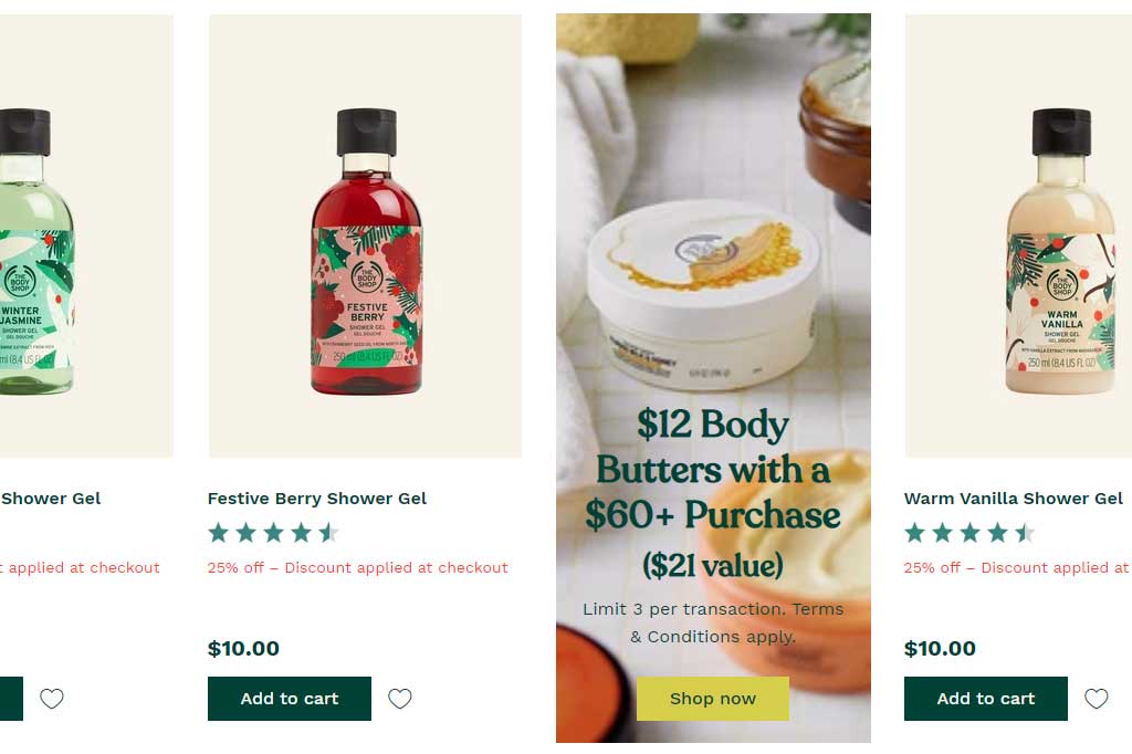
We love the way The Body Shop puts their banners in line with the product images. The shopper is immediately able to start viewing the products upon landing on the category page. And with the banner being nestled in amongst the products, the eye doesn’t immediately pick it out as advertising or promotional. It has a better chance of being fully viewed, and not just skipped over.
Furthermore, clicking on the banner is subtly encouraged because it’s already in line with the other clickable page items (aka the products).
Product Images
Hand in hand with the category and homepage images, there are the product images themselves.
Just like a brick-and-mortar store would have their products neatly lined up in an attractive display, with adequate signage and clear labels, you too need to present your products the same way.
Providing bright, clean, high-quality and attractive images can do wonders for the appeal of the product. Without being able to hold, feel, smell, and otherwise experience the product, the shopper has to put all their faith into the product image and description. Take a look at the product images from Miscela d’Oro.
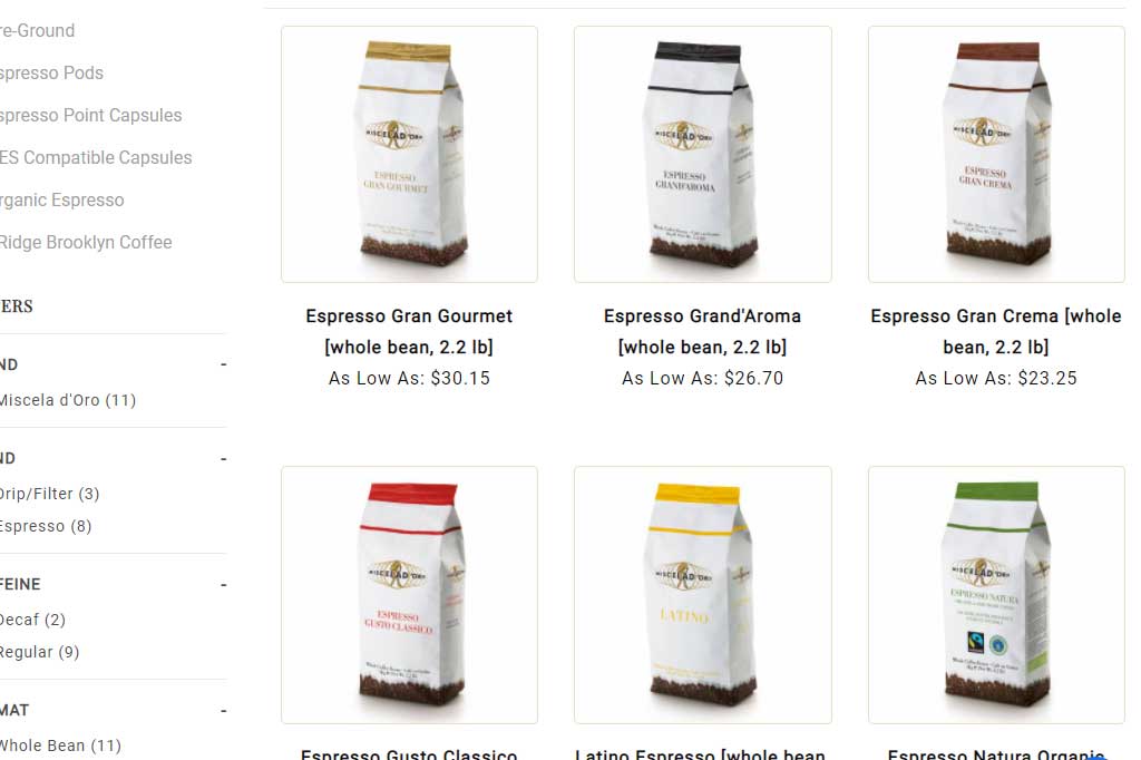
Besides the images themselves looking attractive, they should also be presented nicely. We’ve spoken before about the importance of good product images and that includes how they look in the category. Similar product styling and consistent image sizes will help create a cohesive and visually appealing display.
Appealing Categories
You probably think that all your categories are appealing. That’s why you have them. And to your dedicated shoppers and product enthusiasts, they probably are! But we are referencing more generally appealing categories. Ones that tend to interest everyone and give new customers an easy place to start.
- New
- Featured
- Favorites
- Best sellers
- Seasonal
- Sale
- Clearance
These categories can easily give your shopper direction and a place to start if they are new to your site or your product line. Because they are familiar across the board for eCommerce, they can be a great way to introduce your customer to your brand.
Most sites tend to have 2 or 3 of the categories mentioned above. Don’t just stop at “having them” though. Like any other category on your site, they should be properly merchandised as well.
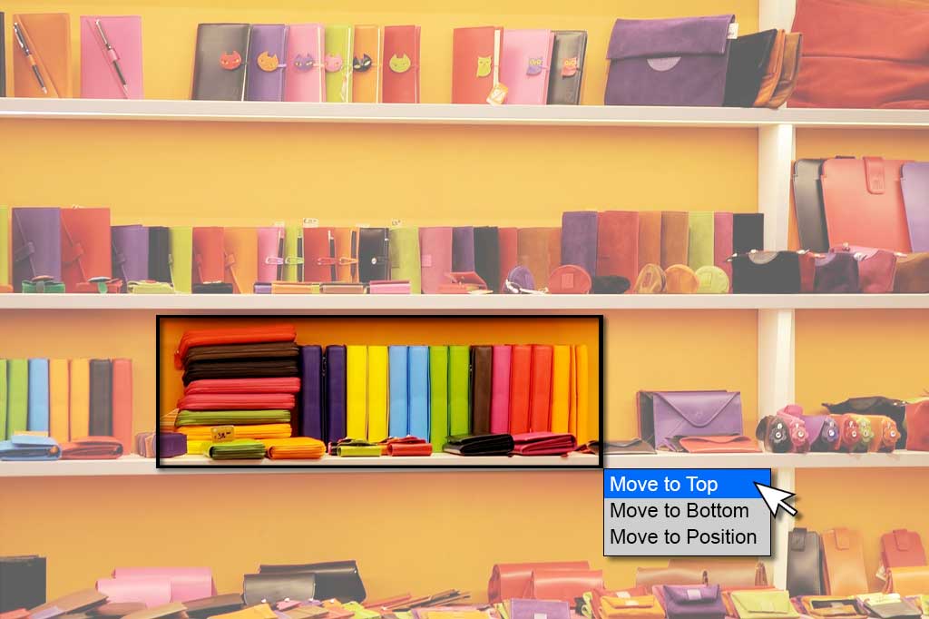
Sorting
You are probably familiar with going into a store to find that it’s been completely rearranged. While it can be super frustrating for stores that sell your everyday essentials, like the grocery store, it is also a very effective way to present new products to your users.
There are plenty of ways you can take advantage of sorting your products and categories.
- Seasonality. Moving your out-of-season products and categories to the bottom of the list to make way for other appropriate goods can make sure that your shoppers are seeing pertinent items when they need them.
- Sale or Clearance. If you want to push your clearance and sale items to sell as many as possible, don’t hide them at the bottom of your lists. Just like Google search results, the products on the first couple pages have a better chance of being seen.
- High Inventory. Do you have an overstock of products? Planning on discontinuing a product and want to clear out your inventory? Get them front and center in the list.
- High Margins. It’s very likely that you have some products, brands, or collections that simply earn you more money. If they offer you a higher profit margin, move them to the top of the list to encourage purchases.
- Exclusivity. Offering an exclusive brand or collection is a surefire way of earning repeat business and a dedicated customer base. Make sure your users know you carry exclusive brands and products, and show them prominently.
- Ease of Use. Merchandising isn’t always solely about increasing your profits. It’s also about making the shopping easier for your user. Sorting your products and categories in a logical way can help your users find what they need easier, and also find related or parallel products.
Site Features and Tools
You may already have features and tools on your site that are there specifically to help your shoppers find what they need. Or maybe you’ve been thinking of adding some. From calculators to custom community sections, one thing remains the same: features are a great way to funnel shoppers.
Take, for instance, the parts finder tool that we have on Wingstuff.com. Of course, being able to enter the model and year of their GoldWing motorcycle will help the customer navigate the site easier. That’s good news for both the shopper and the store owner. Using the feature delivers the shopper directly to a whole host of products that are specifically applicable to them.
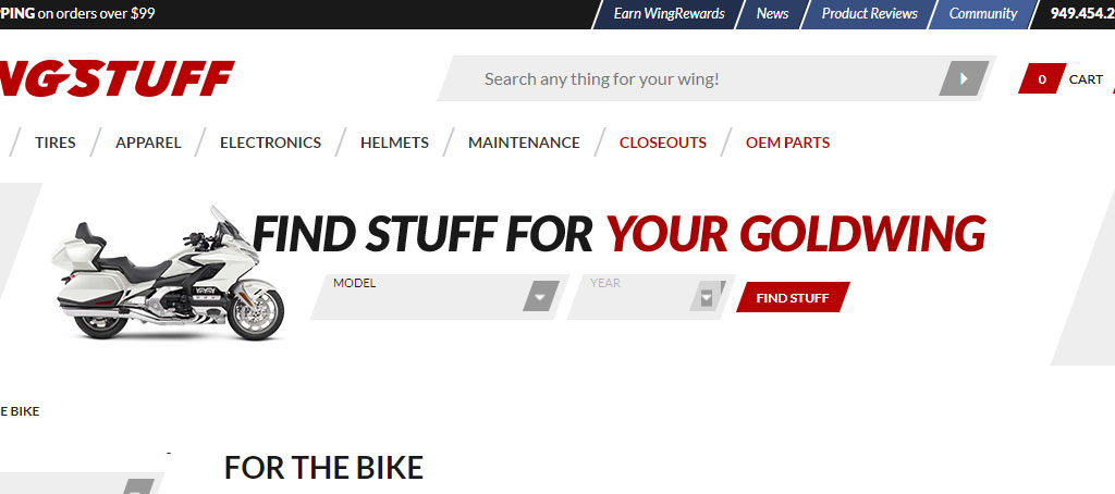
The mark of a truly successful site feature is that it helps both the shopper and the store owner succeed. But how is this merchandising? It’s yet another way for you to show products and categories to your user that they might not have otherwise seen. And you’re doing it in a way that is specifically applicable to that person.
Recommendations
Recommended product sliders are the aisle end-caps of the eCommerce world. A classic merchandising strategy.
The products and categories are singled out and recommended, relative to the page you’re on. If you’re on the website homepage, you’ll likely find some recommended categories that will help you get started in your shopping journey.
On a product page, or in a category, the shopper might see recommended products suggested based on what they have already viewed, the page they are currently on, or products that are typically purchased together..
Keeping your recommendations logical and relevant will help this be a successful merchandising method for you. They help promote impulse purchases (which REALLY add up!) and can remind your shoppers of add-ons and accessories that they may have otherwise not thought of.
Merchandising Can Be Quick and Easy
This is by no means an exhaustive list of the different ways you can visually merchandise your store. But it is a list focused on things you can do yourself. The preceding options are quick and simple to implement once you decide what your main goal is.
They will allow you to change up your store on a regular basis to make sure you’re moving inventory, getting the word out about an exclusive brand, or highlighting an oft-overlooked product.
If you need a hand implementing or adjusting any of the suggestions made in this article, feel free to get in touch with us. We’ll be happy to make a plan with you.