Estimated reading time: 8 minutes
Your ROI (return on investment) can depend on a countless number of variables. Is your ad running enough, in the right places, visible to the right people? Is your site well laid-out, with appealing visuals, and an effective interface? There is a whole host of things that will influence whether or not you get that click. Ultimately, the clincher is the call-to-action (CTA).
Maybe your ad, product page, or social media post performs well in every other respect. But if your CTA is weak, you risk losing the click that secures you a view, a sale, a share, or a signup.
What Exactly Is a Call-To-Action?
Calls-to-action are instructions to the audience, in order to provoke an immediate response…at least that’s the goal. They are typically words or phrases that include a direct command. This command should pretty clearly guide your viewer to complete a specific task.
That task can vary, depending on your industry and your business. CTAs aren’t just used in a commerce situation. You find them on petitions (“Sign and Share!”), blogs (“Subscribe for more”), packaging (“Visit us on social media”), medical facilities (“Get tested!”), and more.
In fact, you likely see so many of them a day that you don’t even notice anymore.
The Good, The Bad, & The Ugly of Calls-To-Action
- “Buy Now!”
- “Submit”
- “Click here”
Those are all extremely common ones that you potentially see dozens of times a day. The problem is, you – as a consumer – are being asked to participate by so many different businesses and institutions, that the brain gets a little water-logged by them all. You become oversaturated and you start to filter out the calls-to-action that you see. That means you, the business owner, has to work a little harder to avoid some common pitfalls (and disasters) when creating your CTAs.
The Bad
I know, we’re going a little out of order here, but it’s easiest to pinpoint what you should definitely avoid when creating your own call-to-action.
One of the worst things you can do with your CTA is make it boring. This can happen with your choice of copy, and the CTA design. If you find yourself using the same tired verbs as everyone else, you’ll fall into the trap of becoming invisible; there are only so many times you can be told to “Buy now” in a day.
Even worse, if your users can’t even find your call-to-action, then it doesn’t matter how compelling the text is. The CTA needs to be a button and it needs to be bold.
To help your calls-to-action stand out, avoid the following pitfalls:
- Don’t let it blend in. A button visually stands apart from the rest of the page, drawing attention to it. It also gives our simple human brains the immediate satisfaction of completing a task and getting a reward. It’s one of the reasons buttons have been used so successfully throughout history in all manners of consumerism. Avoid using in-line text links; they simply won’t get enough attention.
- Don’t be vague. Let your user in on exactly what they will get in exchange for pushing the button. This is no time to play coy!
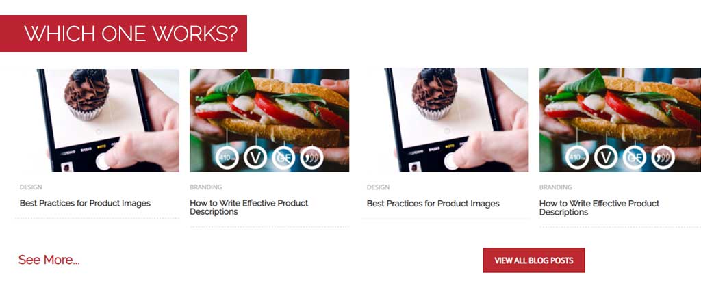
- Don’t be passive. This is simpler than it sounds; use a strong verb! Specifically refer to the action (Subscribe, add, buy, get, etc.) and stay away from the passive ones, like “See” in our example below.

“See More”
While it does contain an action word (“see”), the command is vague. See more of what? It reads more like a suggestion than a command. Also, “seeing” something is a passive action, compared to actively viewing. And finally, the plain text link doesn’t stand out against the rest of the design.
“View All Blog Posts”
This bold red button contains a verb (“view”) and is also specific as to what the user will gain from clicking the button (“all blog posts”). It cues the user into a specific reward for following through with the action of clicking that big red button.
The Good
We’ve covered the basics of what your CTA needs: A button, an action, and a reward. But what are some things that will really push your CTA over the top, performance wise?
Button Design.
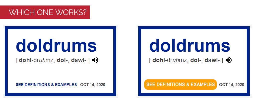
Use a bold accent color for your button. Depending on your design, the color may be a direct contrast (ie. blue site with an orange or yellow button), or something that coordinates – but make sure it pops! Basic color theory will let you know which color you should use for your button to have it best stand out against the rest of your page. It should be prominent and have a defined shape; make sure your user’s eyes don’t scan right past it.

Obvious Placement.
When it comes to the placement of your CTA button, being unique isn’t important or wise. In fact, this is one time you want to be predictable and follow the usual formula. Tucking the button in an upper corner may keep your page clean, but it makes your shoppers have to search to complete your action, assuming they even find the button to begin with. Follow the standard top-to-bottom format that shoppers use when viewing a page. Place your CTA at the end of your content.
Unique and Compelling Text.
The text on your button should be short and unique, to hold interest. Even though it’s only going to be a couple of words, it should still reflect your brand’s voice. If you run a high-end jewelry store, which sounds more appropriate for your customers and your brand? “Check it out!” or “View the full collection”?

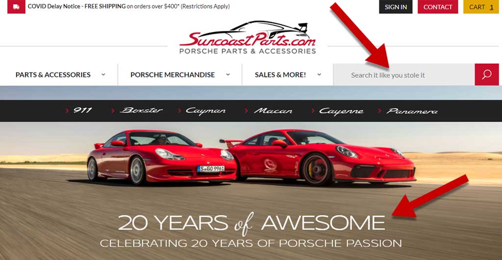
In this example, the CTA text in the search bar perfectly coordinates with the voice of the other marketing material on the site. The prompt to “Search it like you stole it” appropriately shares the same tone as the product line and the rest of the site.
Consistency.
Your CTA text should be consistent with the rest of your site. If, in an article, you repeatedly refer to a downloadable tutorial, don’t then use the word “guide” or “resource” on the CTA download button. While it may seem obvious to you, and they are synonyms, a user that is scanning the content may not immediately connect the two. That quick lapse in connection could be enough to lose you a conversion.
The Ugly
There are some treatments you could use with your CTAs that aren’t merely “bad”, they are potentially unethical, down-right dirty, and maybe even illegal.
Guilt-Tripping
Laying a guilt-trip or otherwise shaming your users into clicking is tacky and more often than not, will scare them away. Most people love a bit of comedy but not if it’s at their expense; using cheeky CTA text can make your user feel attacked.
Astroturfing
This term refers to the act of hiding or covering up the sponsor of a message. It’s often used in shady political marketing, but has also been used in commerce settings. When it comes to your CTA, being unclear about a sponsorship, an affiliate link, or a third-party sign up is a big violation of your customer’s trust.
Skipping Opt-In
If, by clicking your button, your user has unwittingly opted in to a marketing campaign (ie. newsletter, notifications, sales, etc.) that may end up crossing legal boundaries. Opt-in laws are pretty clear about the fact that your user must be told specifically that they are signing up for something by clicking. If you offer a downloadable guide but don’t share that the act will also sign the user up for your marketing, you could land in hot water.
Is Your Call-To-Action Necessary?
After all the work you put into designing and crafting your perfect call-to-action, hopefully it’s worth even clicking on. We mean worth it for your user. Make sure you actually follow through with a meaningful action in relation to your CTA.
As we mentioned earlier, the reason buttons and action phrases are so effective is because the user gains a pretty immediate sense of accomplishment from clicking…assuming something actually happens.
- Newsletter signup? Make sure you have a confirmation email trigger set up, welcoming them to the fold.
- Add to cart? Confirm that the item has been added! Maybe the mini basket expands to show this, or the “Add to cart” button on the product page changes to “Added!”
- Sale or new collection button? Redirect your shopper to a dedicated landing page, specific to that button.
And most of all, ensure the action lines up with what you promised in your text. These micro interactions help to build trust and goodwill between your brand and your shoppers.
If you need a hand implementing some new calls-to-action or you feel like yours aren’t performing well enough, reach out to us for help.