
Estimated reading time: 10 minutes
Recommended product sections can give your shoppers a carefully curated look into the rest of your product catalog… if they’re used correctly.
UI/UX developers and designers work diligently to create a balance on your website. They need to be sure your shoppers are being provided all the necessary information and options (which can be plentiful!) but also don’t feel overwhelmed. They do this by creating a guided shopping experience, without your customers even realizing they are being led. At least…the good UI/UX dev and designers do this.
So when you don’t use an area of your website to its fullest potential, you’re missing out on an opportunity for conversion that has been laid at your feet by your developers. The recommended products section is one such example. They are often woefully mismanaged and end up being nothing more than space fillers, or not even employed at all. Let’s take a look at a few ways to fix that. If you need some inspiration or guidance about what to include, then keep reading.
Different Types of Recommended Product Sections
Depending on your specific site design, you may find several different recommended product sections during the shopping process. Used correctly, each one can have a different impact on your shopper’s journey throughout your site.
Homepage
Your homepage is like the window display of your store. You want to catch the customer’s eye, inform them immediately of what you sell, and help guide them on where to go next. Just like in a window display, you want to showcase some featured products.
Homepages are different from other pages in that generally, it isn’t the apex of a sales conversion. On a product page, your goal is to get the shopper to click “Add to Cart.” On the basket page, your goal is to get the shopper to click “Checkout.” Those are critical conversions for an online store. With the homepage, however, your conversion target isn’t a sale, it’s a click-through. Your goal is to convince the browser that you have what they need, to turn them into a buyer, and to entice them into moving deeper into your site.
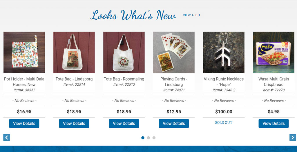
This may happen by providing blog content that presents a solution to a problem (i.e. a walkthrough tutorial, complete with links to the needed products). Or maybe you promote a sale that provides a different type of solution (ie. getting the product cheaper than the other guy sells it). Another way is by giving your shoppers a taste of some of your stand-out items via your recommended products section, often called Featured Products.
Category Page
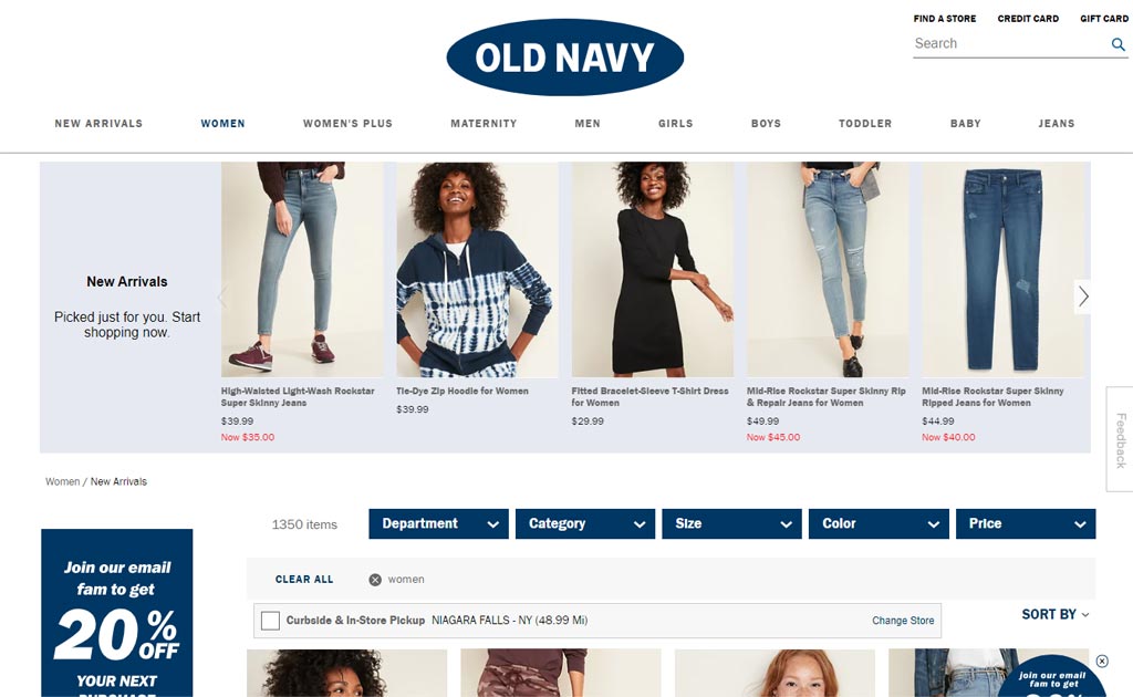
At this point, the shopper has started to explore what you offer but still needs some guidance. There are already a ton of features on the category page that help the shopper decide what to do next.
Your facets, “sort by” filter, and even your photos, prices, and star ratings shown on the category page are all indicators for your shoppers. They help guide the user toward the product solution that’s right for them. But searchers in general, don’t like clicking past the first page of results. Less than 1% of searchers bother clicking on anything on the second page of Google, and their habits aren’t much different when it comes to shopping.
A recommended product section can highlight some of your more popular products to your shopper and is especially useful for the casual browser. Someone coming to your site with a specific product in mind may be less likely to click through (unless that item is in the product carousel, of course), but for those window shopping, the recommended product section will draw their attention.
Product Page
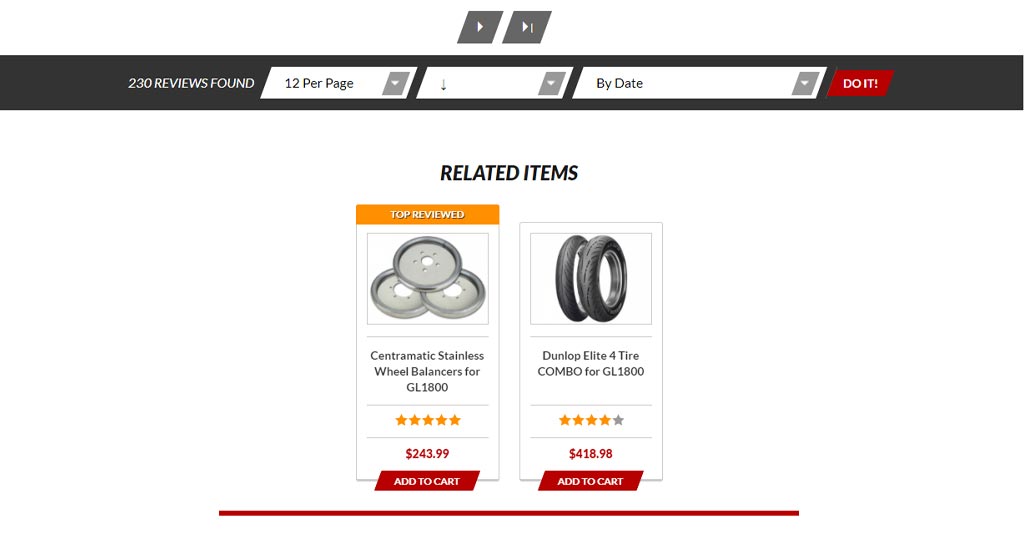
The product page is the most popular place for recommended product carousels or sliders. It’s typically a built-in feature of your platform and is usually easily manageable by the store owner.
Offering other items on a product page might seem like a bit of a roulette game; do you risk distracting your shopper from hitting the “Add to Cart” button when they’re so close? Placement and styling of the slider will help make sure that it adds to your bottom dollar instead of diverting it.
Ideally, the recommended products section is found below the “add to cart” button and helps lead your shopper the next must-have product on your site that would go perfectly with the one they just added to their basket. If populated properly, it can assist in continuing the shopping journey.
Basket & Post-Pay
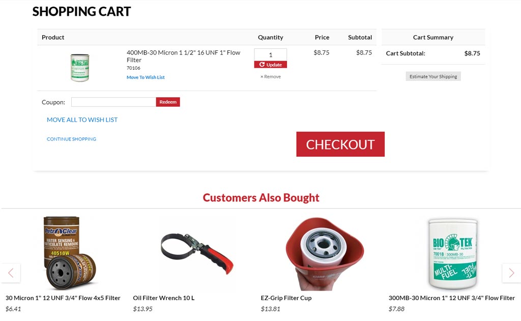
Less-frequently utilized than some of the other options, the basket and post-pay product recommendations are a missed opportunity for further sales. The basket recommended product section is ideal for last-minute impulse purchases.
About 80% of adults have made online impulse buys. Having a recommended section in your basket is the online equivalent of the chocolate bars near the register at the grocery store. They are placed there specifically to catch the shopper’s eye before they commit to their purchases. These are especially useful if you have an order minimum or offer free shipping above a certain dollar amount. They can be just the thing to push the shopper up and over that threshold.
When it comes to post-pay, providing some recommendations in the confirmation email is a great way to pull them back in for secondary purchases. Want to give your shopper a bit of a breather before presenting them with more items? Sending a follow up email a couple of weeks after shipping requesting a review is a great time to offer some related products, based on the order they previously placed.
What Should I Put in My Recommended Product Sections?
An effective recommended product section requires much more than skilled placement and design. Putting appropriate products in your recommended sections can make all the difference. But knowing what’s appropriate can be tough, as it varies depending on your industry and your customers. It also varies based on which area of the site you’re populating.
Homepage
Your Google Analytics will tell you well enough, that a ton of shoppers reach eCommerce sites by Google search, and that search will often take them directly to a product or category. However, we will likely still see that a ton of visitors (maybe even the majority) access your site via the homepage.
As we mentioned earlier in this article, the homepage is responsible for drawing the shopper in, letting them know what you have to offer, and how you can solve their problems. The recommended product slider is one way to do that. Often listed as a “Featured Product” section, this area is great for showing off any of the items on the site you want to promote.
Here are some product categories and items that you might want to consider featuring on your homepage:
- Clearance or special sale items
- Newly added products
- Highlighting a brand or a particular product line
- Seasonal items that need a boost in sales while they are still relevant
Category Page
It’s not surprising that your category page recommendations should highlight the products found in that category. Having a section here gives you the opportunity to do some visual merchandising for your site (something that is often overlooked in eCommerce).
Think about your site as a clothing store, and clicking on the category page is like walking into a different department. The recommended section is like a group of mannequins, and your products are the clothes. Maybe in your case, the “clothes” are car batteries, or crystal chandeliers, or sandwiches. Regardless, they are on display, front and center.
- Here are some things you could consider putting on display in your categories:
- Best sellers (ie. guaranteed money-makers)
- New releases that need promoting
- Items with stock on hand that you’d like to clear out without having to put on sale
- Items on sale!
- Products that offer you a higher profit margin, and get you more bang for your buck
Product Page
Here’s where your recommended products get a little bit more nuanced. The items in this section need to be related but still, offer your shopper variety. There’s always a chance that your shopper will see a product in this section, and it will coax them away from the current product page. Don’t side-track them too much by offering products that no longer provide a solution to their problem.
Instead, focus on adding products that will offer alternate solutions to the same problem or offer further solutions. For example, if a shopper is on a product page for a bowl, an alternate solution would be a different style of bowl. A further solution might be that bowl’s full set of dishware sold as a bundle or plates in the matching pattern.
There are a ton of ways to approach product page recommendations. Here are some to try out:
- Similar product type (i.e., pink shoe vs. blue shoe)
- Products with similar attributes (i.e., pink shoe vs. pink hat)
- Items containing that product (i.e., pink shoe vs. bundled product containing pink shoes, hat, and t-shirt)
- A similar family of products (i.e., other items from the product line with a distinct design)
- Add-on products (pink shoelaces for the pink shoes)
Basket & Post-Purchase
This is an opportunity often missed or neglected by store owners. Just because you’ve managed to get the shopper into the checkout, it doesn’t mean your work is done!
If you can manage to tack on an additional item in the basket by way of an impulse purchase, that’s a big win for everybody! Consumers get a physical rush of pleasure when it comes to impulse buys, and we bet you get a rush of pleasure when you see higher sales. For best results, the items shown here should complement the items already in the basket.
The post-purchase recommended products, however, are possibly more important than any other on your site…and they aren’t even on your site. An email sent after a purchase is made (like an order confirmation or a follow-up email a week later) helps to draw the shopper back to your store. Repeat customers spend significantly more than new shoppers and cost less to obtain.
Here are some ways you can approach your basket and post-purchase recommended products:
- Products with a similar or complementary function (i.e., pink shoe vs. stopwatch)
- Item accessory (i.e., pink shoe vs. extra shoelaces)
- Promotional items that are “hot buys” or easy sells, based on your specific client base
- Data-mined products. There are plenty of 3rd party applications (like Sendlane) that will use machine learning to predict effective recommended products for your customers and include them in follow-up emails. They use the information gathered while your shopper was browsing your site.
Populate Your Recommended Product Sections Thoughtfully
However, you decide to fill those sections on your site, do it with real forethought, as opposed to plugging in products just to get something in there. While having something may be better than nothing, you’d be missing out on a real opportunity to assist your customers in meaningful ways.
By knowing your products and knowing how your users shop, you can anticipate their needs and help provide solutions for them that they maybe didn’t even realize they were missing. If you need a hand integrating recommended product sections onto your site, or maybe even just want a hand doing the data work of adding the items, reach out to us. We can help guide you to a solution that works.