Estimated reading time: 5 minutes
Anyone who has dabbled in design or marketing knows that it’s the little things that work together to make a big impact on users. Oftentimes, the effect seems so slight that it results in an unconscious decision made by the shopper. They don’t even know they’ve been persuaded into something. The results of that “little thing” can mean the difference between clicks, sales, subscribes, and overall impressions. This series is going to talk about how those little things can play a big part on your site.
To continue with this series, we are going to look at one thing that every site has in common, from the little homemade start-up sites built 20 years ago, to the cutting edge, top of the line, mega-corporate websites: buttons!
Believe it or not, subtle changes in your button design can actually influence whether people will want to click on it, and what they expect to happen next.
Color is usually the most talked-about design feature when you look at buttons. But that’s an easy one! The answer is probably going to be: complementary to your site color (aka a color that will stand out against it without clashing). Instead, let’s look at the real sleeping giant of the button game… shape!
Button Shape: Round or Square
Besides the obvious answer of “rectangular”, there is more to consider for your button shape. For example, when looking at usability, you want to make sure the button is tall enough for the average finger to tap it on mobile without accidentally running into other clickable items, or missing the button altogether. But that’s boring stuff.
The fun thing about button design is that whether the shape has square or rounded corners can make a real difference in perception. Consider the Bouba/Kiki Effect. This is a psychological phenomenon that describes the difference in how we perceive shapes and the effect they have on us. (Who woulda thought psychology would have an impact on button corners… see? Fun!)
Bouba/Kiki
Take a look at the following two shapes.
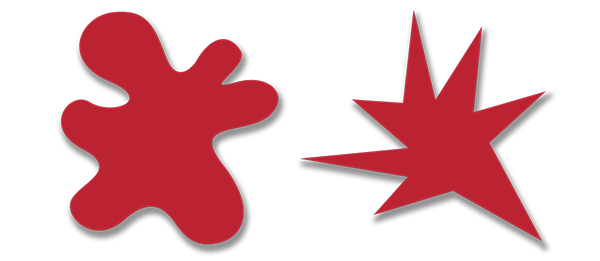
Now, which one of those is a Bouba, and which one is a Kiki?
There’s a pretty good chance (in fact up to 98%) that you called the rounded image Bouba and the pointed one Kiki. This is a trend that scientists have found transcends gender, race, nationality, language barriers, and generation. In addition to finding that people worldwide share common babytalk, it signals the following:
- People find rounded shapes to be gentler, more up-beat, and more fun.
- People find pointed shapes to be more aggressive, serious, and important.
Contour Bias
Similar to the Bouba/Kiki Effect, contour bias will also play a part. Believe it or not, our simple human brains actually become afraid of pointy things. The amygdala, a portion of your brain responsible for processing fear signals, activates when it looks at things with sharp edges and pointy spots.
Ok, so maybe shoppers aren’t quaking in their boots when they see a button shape with sharp corners, but it can trigger responses that are common when fear is present, like heightened awareness and weariness.
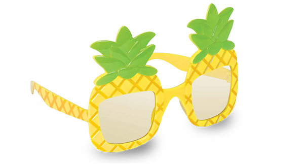
On the other side of that coin, rounded objects appeal more to the human brain because they appear softer, more organic, and pleasing to the eye, encouraging the interaction. They also process on a much more basic level than pointy things, meaning the viewer doesn’t think too hard about the shape. That’s a good thing when you’re a hardware store trying to upsell sunglasses that look like pineapples.
Different Button Shapes for Different Uses
These effects are admittedly subtle. It’s not like a shopper is going to see a rounded button shape and hand over their debit card. Instead, the rounded shapes can gradually influence your shopper as they browse, and inform their opinion about your brand. Soft edges and corners will give a sense of levity, humor, and cheer to your branding, which shoppers will easily connect with.
There are, however, instances where square corners might be right for you. They are certainly more traditional, as they’ve been used since the inception of the internet. So if you sell products that appeal to an older generation, have a more serious nature, or you’re aiming for a more upscale appearance, square corners may be for you!
They are also successfully used with cookie policy buttons. That same sense of austerity that sharp 90° angles evoke is appropriate when asking your shoppers to agree to certain policies and disclaimers. Meanwhile, if you use mostly square buttons on your site, adding a rounded button for your newsletter sign up subtly suggests that good times are coming!
Reward your shoppers with that sweet rounded-corner action for some positive reinforcement and overall happier vibes. And communicate when you mean business using angles and points. Either way, consider how you want your users to view your brand, and how your buttons interact with that message.
Have you found yourself with button shapes that don’t suit your brand? Contact us and we can fix up those corners for you.