
Estimated reading time: 11 minutes
The check mark-shaped swoosh, bold and instantly recognizable on a pair of shoes. The red and white script that exudes “classic” that makes you want an ice-cold cola. The simple blue logo that has commandeered the letter F and taken over the internet. These are branding decisions that have been made after endless hours of market research, millions of design dollars, and years of building a reputation.
The world’s most recognizable logos have been paired with carefully-chosen color palettes, font styles, and text (like slogans) to create cohesive branding packages. In comparison to the products sold, the company values, and the business reputation, these branding decisions may seem like small-potatoes. But as superficial as they may seem, they play a major role in how your brand is perceived and remembered (or not).
The Power Of Thoughtful Branding
Nike is coming up on 50 years of using that check mark-shaped symbol trademarked “The Swoosh”. It’s one of the most recognizable logos in the world and that recognition doesn’t just come from the fact that they’ve been using it for almost half a century. At face value, the logo seems overly simplistic. There’s no detail, no recognizable color scheme, no literal representation of anything, right? It’s one of those logos that makes you think “I could have done that!”. However it’s that simplicity and boldness that makes the logo so unique. In one simple mark, it conveys a sense of movement and speed – perfect for a brand like Nike. And it went on to form the foundation of the Nike branding overall.
When the company added their brief but commanding slogan “Just Do It’ in the late 1980s, it paired perfectly with the inconspicuous logo. With The Swoosh echoing the look of a check mark, it started taking on a new meaning beyond just speed and dynamics, once it was paired with the slogan. The Swoosh became a call to action: To get that thing done, to try something new, to cross the finish line. “Just Do It” was the prompt, and the Nike check mark was the encouragement that you could get “it” done. It’s that sort of thought and direction that makes the Nike brand so powerful and recognizable.
But of course, they have billions of dollars to work with, to get everything just right. Thankfully, you don’t need to have the same budget or team of experts to create powerful branding for your own business.
Examining Your Visual Branding
There are a lot of things that contribute to branding. Visuals (like logos and color-schemes), the company voice (interpreted through text and marketing), social media presence, and reputation all play their own crucial roles.
But your visual branding will be the one that ties everything together. Maybe you have a killer social media presence and award winning customer service. But if they aren’t instantly recognizable as belonging to your company, they aren’t really doing anything for your brand. Humans are highly visual creatures. We rely on shapes, colors, and patterns to form connections. If your logo doesn’t stand out, and isn’t cohesive with the rest of your brand, you’ll have trouble forming meaningful customer relationships.
Here are some things to keep in mind as you develop and design your visual branding.
Color
You could fill a library just with books on color theory and its relation to the human psyche. We won’t get that in-depth here. To keep it simple, color can subconsciously elicit specific responses in a viewer. Some schools and prisons use pink-walled rooms to calm violent behavior. Decorators promote painting your kitchen blue or green to help curb your appetite. The audience you want to attract and what response you want them to have to your brand should play a role when selecting your color-scheme.
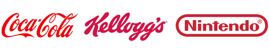
Red
Representing passion, and love, it also evokes courage, strength, energy, and motivation. Red is a powerful color. You’ll see it reflected in branding giants like Coke, Kellogg’s, and Nintendo.
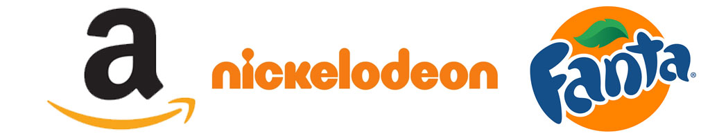
Orange
Confidence, friendliness, and success typically makes orange a great color for up-beat branding. Nickelodeon, soda companies (like Fanta and Crush), and even the orange smile in Amazon’s logo show the positive effects of orange.
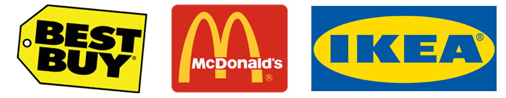
Yellow
Yellow tends to immediately remind people of the sun. Optimism, fun, warmth, and joy are all represented with yellow, as are attention and logic. You’ll see these traits represented in the advertising for brands like McDonald’s, Ikea, and Best Buy.
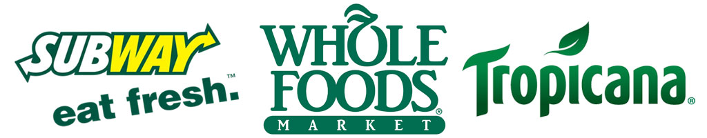
Green
With freshness, growth, nature, and balance, it’s not surprising that you’ll see green used in brands like Whole Foods, and John Deer. Food companies that target “freshness” as a main attribute will also use green, like Subway and Tropicana.
Blue
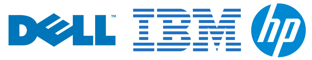
Blue evokes a feeling of trust, dependability, and stability. Consider how many tech companies use blue in their logos, like Hewlett Packard, Dell, and IBM.
Purple
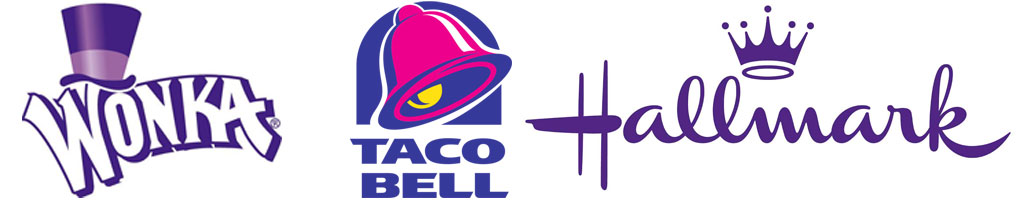
Pink and purple are often used in brands that want to be viewed as imaginative, creative, and wise. They also promote the feeling of sentimentality, as in the childhood candy classic, Wonka.. Think about Taco Bell’s purple and pink logo and their slogan asking you to “Think outside the bun”.
Black/White/Grey
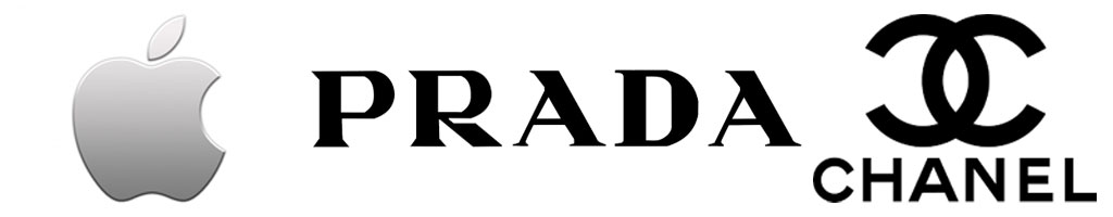
Black, white, and grey branding has a way of evoking trust because it’s viewed as prestigious, classic, and serious. Just like the idiom of something being “black and white”, brands with these colors come across as authoritative and absolute. Many up-scale clothing brands like Dolce & Gabbana, Prada, and Chanel use the colors, not to mention Apple’s silver and white.
Rainbow
Multicolored or rainbow logos depict diversity, and range. Whether the diversity is in reference to the people you serve, or the products you sell, a multicolored logo will help make that point. Google, eBay, and NBC, for example, all boast broad range in a variety of ways.

You can see how you’d select a color based on the products you sell, to accurately represent yourself. However, you can also select a color to help sway public opinion in a different direction.
Take a look at a company like BP. As an oil company that has had their share of bad press, they use a bright green and yellow logo (literally in the shape of a flower) to subconsciously give the impression that they are environmentally conscious.

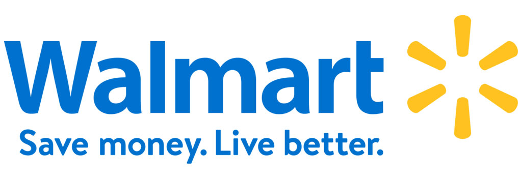
Walmart’s addition of a bright burst of yellow to their logo in recent years helps to add a cheerful, youthful touch, despite their own long-lasting streak of negative public opinion.
When choosing your color scheme, consider the values of your company, the message you want to promote, and the experience you intend to deliver to your customers. While companies do often “re-brand” now and then to freshen their look, they typically keep the same general color palette and imagery, to stay recognizable, so choose wisely.
Imagery
As in a few of the examples mentioned above, including specific imagery in your branding can really help deliver the message. A small graphic in your logo (like Walmart’s sunburst), the designs used in your advertising, and the full-sized images used on your website all play a part.
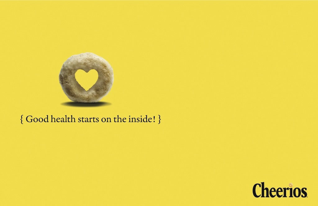
Let’s look at Cheerios, for example. Most people are familiar with their classic black-on-yellow, a reflection of warmth, wholesome fun, and dependability. Cheerios has been a household staple for decades, and they pride themselves on the simplicity of their product. You see that reflected in their ads, with simple colors, simple imagery, and simple text:
Their website also carries over the same theme with straightforward images promoting the wholesome nature of their brand:

They even keep the design of the website elements (like the header and footer navigation menus) clean and basic:
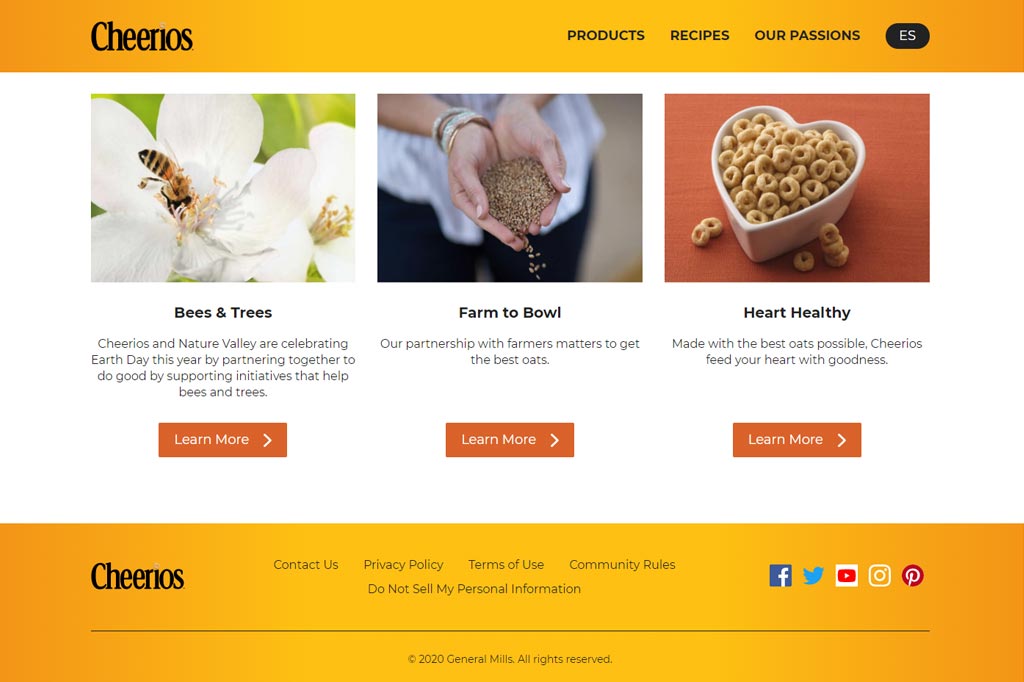
Regardless of the channel, when you come across Cheerios branding, you recognize the features and you know to whom they belong. With an image of their product in the logo, there wouldn’t be any mistaken impressions, even if you weren’t already familiar with the product.

Text and Copy
While visuals play a massive role in the effect your brand has on a consumer, it certainly isn’t the only piece of the puzzle. The text and copy you present can make or break your brand. We currently exist in a climate of cancel-culture (ie. tearing a person or brand down because of a poorly-made comment or action). It’s incredibly important to read, re-read, ask opinions, and check from every possible angle to make sure you aren’t about to make a potentially disastrous faux-pas.
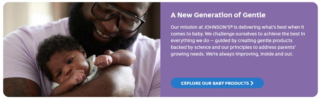
Beyond making sure your text is fault-free, you also need to make sure it vibes well with your brand. It wouldn’t make sense for a brand like Johnson’s, known for their baby-care products, to start advertising using crude humor, or even exciting buzzwords. Their branding is based around care, and nurturing.
Instead, they use terms like “guided”, as a parent might guide a child. They talk about gentleness and growing. They pledge to improve “inside and out”, implying moral responsibility.
When creating the copy for your website, ads, or slogans, make sure you get feedback from as many people as possible. Look at the text from different perspectives to make sure you’re projecting the right energy for the brand. And keep in mind there will be people looking for reasons to light a torch and pick up a pitch-fork, so if you do make a risky choice, be prepared to stand behind it.
Cohesion
Perhaps one of the most important parts of successful branding is cohesion. Keeping your message cohesive and relevant across every possible platform is crucial. If your logo for your candle company is soft pink and purple, but your customers click to your site to find fiery red and black, it’ll cause confusion.
Because colors and symbols have such a strong impact on the perception of a brand, keeping everything analogous is important. It creates trust between your brand and your shopper when they find what they expected to find in your store. Presenting a different tone in your logo or ads in comparison to your website and company values can make the customer unsure of what to expect from you or your products. Look at your logo, colors, text, and site design with cohesion in mind. If you discover that things aren’t quite as unified as you’d want them to be, let us know. We can help make sure your website – from your color scheme and fonts, to more involved changes like your logo creation and development – reflects the image you have in mind for your company.