
Estimated reading time: 12 minutes
When a user visits your eCommerce site, their eyes tend to move the same way they would read a book. For most of your shoppers, that is going to be from left to right, top to bottom. It’s known as the F pattern. That means, generally speaking, your site visitors will instinctively be viewing your product categories before any other information.
With navigation menus typically found at the top of the page running horizontally, or down the left hand side of a page, they will be drawing the eye and holding the attention of your shoppers before your fancy images, or your call-to-action buttons. This is just part of the reason having well-orchestrated categories is so important to your user experience.
Besides the immediate draw of having visually appealing product category menus for your shoppers, there are also the ever-present SEO benefits. Many of the metrics used to gauge and score your search engine ranking have to do with UX (the user experience). That means Google (and it’s counterparts like Bing), may pay as much attention to your layout, design, readability, category names, and structure as your shoppers do.
In general, you want every part of your website to be fully optimized for a premium user experience, and search engine crawlability. But product categories are often neglected.
How Sites Get Product Categories Wrong
There are a few cardinal sins when it comes to organizing and displaying your categories. All in all, anything that makes it harder for your user to navigate your site and find what they are looking for should obviously be avoided. But some online businesses either can’t seem to help themselves, or don’t realize that they are misstepping. Here are a few examples:
Number of Categories
It’s recommended that you should cap off the number of category links to seven, though we do recommend ten and under for our clients, as it can be tricky to narrow them down quite that much. A smaller number of links improves usability and also plays well with search engine crawlers. Having too many categories overwhelms shoppers.
Humans are fairly simple creatures, in the grand scheme of things, and we tend to have quite limited short-term memories, limited to retaining about 5-9 pieces of information at a time. By topping your category options out around 7-10 (or parceling them off into groups), you take away some of the burden on the shopper to remember everything you have to offer.
That said, having too few categories will also cause issues. If the shopper lands on your homepage and doesn’t immediately see a solution to their problem (ie. a hint at something they want to buy), then they may leave. It takes users less than a one second to make up their mind about a website. Hiding your category options under a drop down is enough to convince a shopper that you don’t have what they’re looking for. Take a look at this example:
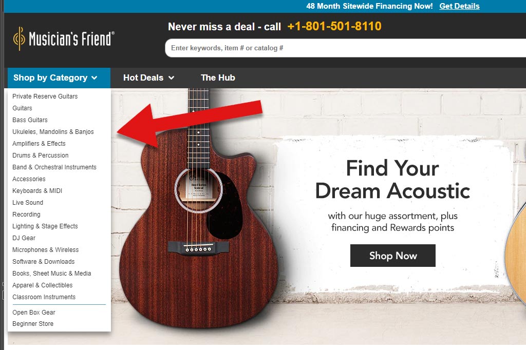
This site somehow manages to offer both too few and too many categories at once. Upon landing on the homepage, you see one main option to view product categories. By expanding the menu, you are bombarded with a long list of unorganized options.
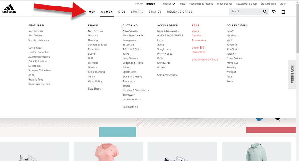
On Adidas’ website, however, you have 6 clear and distinct product categories, which then further expand with the use of a mega menu design. The category options are plentiful, but they are organized and clustered into manageable subsections. Notice below that they again split each of the 6 categories into less than 7 subcategories.
Confusing or Non-Descriptive Category Titles
Repetitive Names
The entire purpose of a site navigation is to offer direction to the user. It helps guide them to the right section of the site, in order to locate and purchase products that fulfill their needs. If your category names are confusing or unclear, the categories become unusable.
Category names don’t need to be complete nonsense in order to be confusing for a shopper. Sometimes being too brief and direct with your category names can be just as bad. Take a look at Sephora’s website.
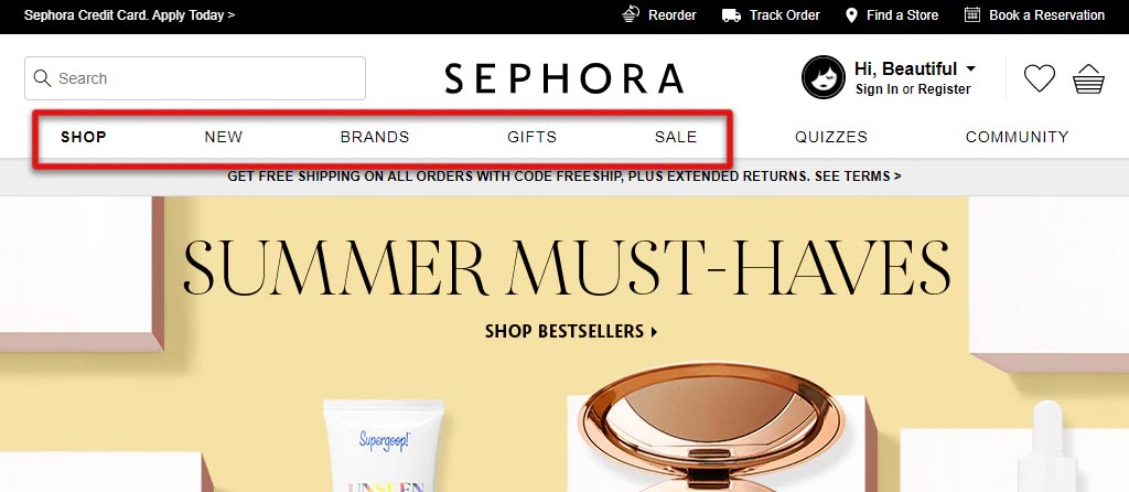
The first five navigation links are Shop, New, Brands, Gifts, and Sale. All of those options are essentially the same thing. They are all ways to shop the site. Not only is it a great deal of wasted visual real estate, it also doesn’t really help the shopper know where to go. The entire site is meant for eCommerce (as opposed to an informational or portfolio site that also happens to offer shopping). Obviously, any user that visits is likely there to shop. Prompting them with a link that says “Shop” is redundant and a pretty poor call to action.
Besides shopping, customers visit eCommerce sites to learn more about the company or contact customer service. Neither of those are options in the site header, let alone the navigation bar.
Concise Names
When you visit Deciem, however, you’re provided with clear product categories that will direct your next click, depending on which type of product you’re looking for, or if you are looking for other site assistance.
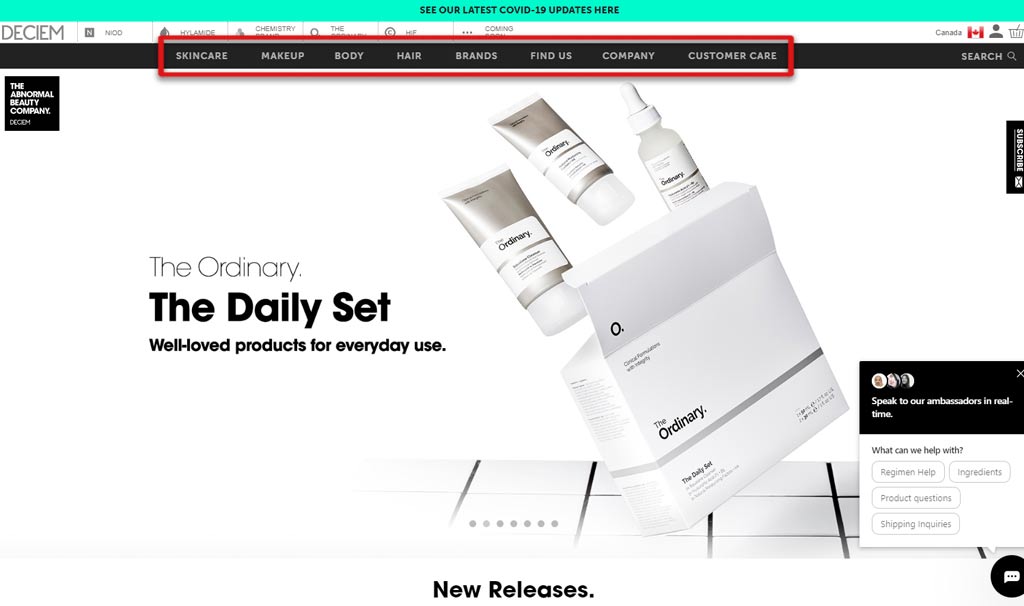
Besides assisting the shopper, descriptive category names will also help with your page authority. Words like “Shop” and “New” don’t provide any information to search engines. Whereas category names like “Skincare” provide a specific clue into what the site is about.
When search engines find that your Health and Beauty website has links called Skincare that then actually lead to Skincare products, it will make the reasonable assumption that your site knows what it’s talking about, thus helping your “authority”.
Improperly Sorted Products
Confusing Structure
A confusing category structure doesn’t just come from the names. It also occurs when you’ve chosen product categories that make sense to you but not your shopper. Consider choosing the way you organize your category hierarchy the same way you’d organize a physical location.
If you went to a party store to buy favors for an event, you might expect wedding items to be in one section, while birthday items are in another. That would make logical sense. From there you might find all Rustic items together, and all Fairy Tale items together. In this example, you can see that the site uses too broad of a top-level category (“Type”). This leads to subcategories being listed together in no logical order.
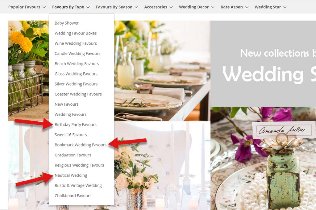
You end up jumping from general “Birthday Party Favors”, to specific “Sweet 16 favors”. From there, you run into a specific item type (bookmarks), all while surrounded by wedding trends like Nautical, Beach, and Rustic.
Logical Structure
In the following example, however, you can see the categories are laid out in a more user-friendly way. You can shop first by occasion, and from there, narrow your options down by theme, and item type.
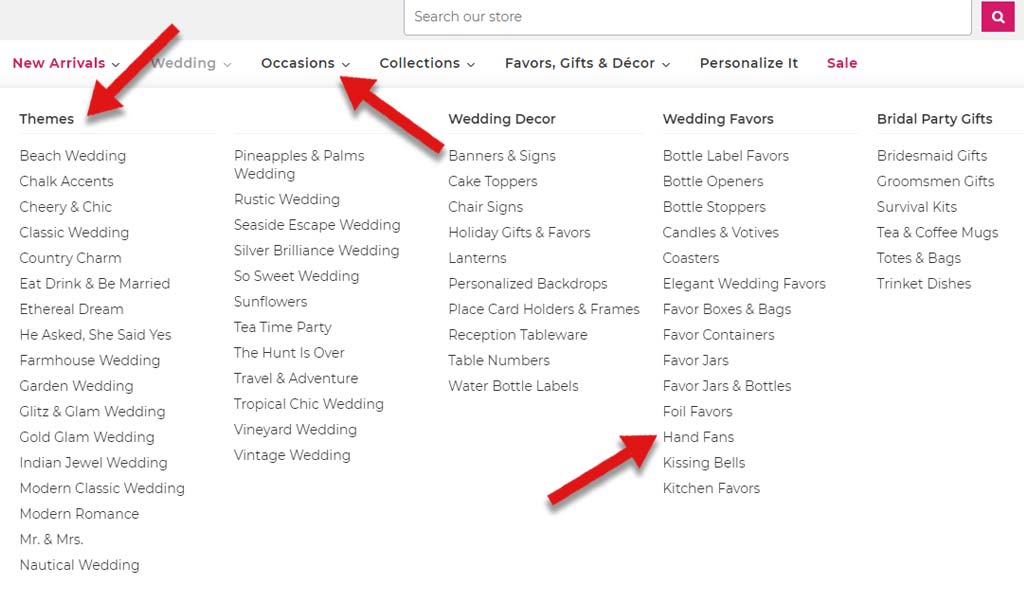
Depending on the types of products you sell, you may end up having unique categories that only have very specific items in them. Each product might only appear in any category once. Or you may have a structure more like the one above, where an item might be in the several categories, and fall under several subcategories based on theme and product type.
It can take a lot of time to arrange your product catalog in a logical way, but it is absolutely worth it. Not only does it improve the user experience for your shoppers, but it will also cut down on lost sales (from confused customers abandoning their search), and customer service time (from having to help customers locate products). It will also help your staff when it comes to managing and maintaining your products. If your categories are clear, there won’t be any confusion when it comes to adding new items.
Solutions for Your Product Categories
There is no one-size-fits-all solution or road-map for every eCommerce site. Different industries and different brands will have their own unique customer base. Overall, that should be what determines the majority of your site design decisions. After all, it is those customers you want to make things easier for. Your site may be optimized to the teeth. But if the experience isn’t a pleasant one for your specific shopper, it won’t be worth the effort.
Here are some things you should focus on to ensure you are keeping both your users and search engines happy.
Don’t Bury the Lead
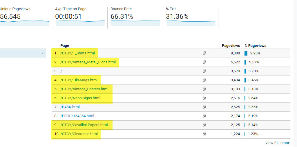
Google Analytics will help you discover what is most important to your users. Take a look at your most-clicked on product categories and pages. You’ll gain a better understanding of what you should be focusing on when you build your main navigation structure.
You may think that it doesn’t matter which order the categories are in, as long as they are prominently represented in the navigation bar. As a matter of fact, humans have such terrible short term memory, that we put preference on recalling the first and last items in a list. We therefore give those items more attention.
There’s an effect known as Primacy (first viewed) and Recency (most recently viewed). Your shoppers will unknowingly pay attention to the first and last items in any list or menu, more than anything in the middle.
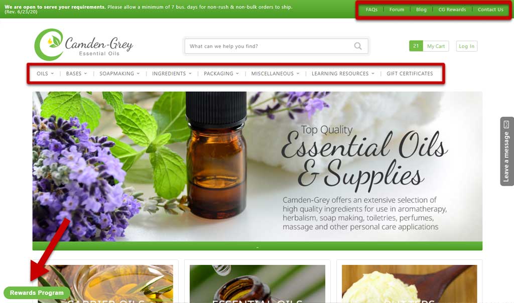
So how can you use this to your advantage? Well, once you’ve tracked down which categories are most important to your shoppers, you can put them in places of prominence! Many sites reserve their far-right navigation items for information pages; contact, resources, blog, guides, about us. Those pages will all do well in that position; it makes them easy to find and will help draw attention. However, if you want to free up your navigation bar for product categories, there are other ways to highlight those links.
- Site-wide information banners (like the ones frequently being used for COVID19 updates)
- Promotional bars that are customized with links
- Global headers
Out With the Old
After you’ve dealt with your most popular categories, it’s time to address the least popular. There are a few main routes to take with the categories that don’t fare as well: Rename, re-purpose, and remove.
If one of your categories is important to you, and holds well-performing products, then you may want to consider renaming it. There may be something about the current name that either isn’t descriptive enough, is confusing, or isn’t highlighting the right feature. Perhaps you have an information page or resource that is critical, but isn’t getting the clicks. Consider moving it to a different location on the site, as mentioned in the previous section.
Maybe you have a high click-through rate for a category, but a high bounce rate. The name of the category is doing it’s job – drawing people in – but they aren’t finding what they expect, and quickly hit the back button. Reconsider the types of products in the category, and re-purpose it in a more effective way.
You may also find a benefit in entirely removing categories. Find a different home for the products held there (assuming they are worth keeping on your site, too); remove the category altogether. It will clear some valuable space, and clean up the appearance of your navigation.
Doing too Much at Once
We wouldn’t be able to discuss product categories without at least grazing the topic of facets. If you’re having a hard time narrowing down your categories, or can’t find a logical structure, then you might need to consider facets.
Maybe you need to add facets, or perhaps you need to adjust the facet options you already provide. Either way, they can help take the stress off your category structure. Where a category is responsible for separating overarching subjects, facets are focused on the product specifications.
In this example, the retailer Concept Lighting sells home lighting. Ceiling Lighting is the category, Chandeliers is the subcategory, Brand, Bulbs, Bulb Type, and Finish are all facets. They are descriptors that are specific to each product and allow the shopper to further sort their products.
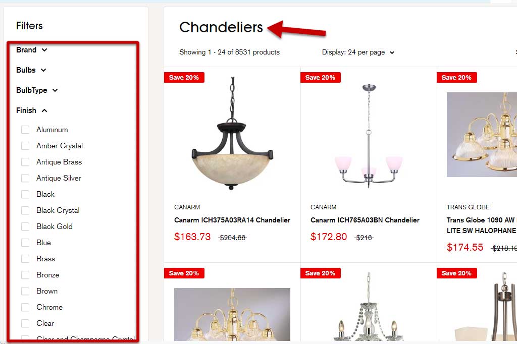
Having a category specifically for Antique Brass chandeliers might sound logical at first; it may even make sense if you have a small product catalog. But when you add more products, and then have to add categories for Aluminum, Copper, Bronze, Chrome, Wood, etc., your category tree will grow beyond a manageable size. Your staff will become frustrated, and your shoppers will get lost.
Updating Your Product Categories
Take a look at your own site navigation and examine how well your product categories are working for you. Do you field a lot of customer service inquiries from people who can’t find what they’re looking for? Do you have a high bounce rate on your homepage because shoppers don’t know where to start? Is your growing product catalog becoming unmanageable and messy? Those are some tell-tale signs that it’s time to take a look at your categories.
If you need a hand building your category tree or implementing changes to your site, contact us for a hand. We can help make sense of your products in a way that suits your sales funnel, and even do the mundane work of resorting and restructuring.