Estimated reading time: 12 minutes
Miva has been teasing us all with a new release for years. For several months we had a short trailer giving us naught but a quick glimpse behind the curtain. But on July 29th, that curtain was finally pulled back to reveal the latest version: Miva 10. One of an exclusive group of agencies, we were given a guided tour, introducing us to the new interface and functionality.
Because we know that our readers are store owners and employees, that’s what we’ve decided to focus on for this review; the parts of the new release that will affect you on a day-to-day basis. Here’s what we think of the new Miva 10.
The New Direction of Miva 10
This new version update is a big one. Generally speaking, when software and platforms release updates and new versions, they are often utilitarian, to send out bug fixes. This release, however, is introducing the next BIG generation in the long line of Miva iterations. With a new interface and a new direction for functionality, Miva seems to be addressing a different goal…
Store Owner Usability
While working our way through the Miva admin, one thing was made abundantly clear by the SaaS itself, as well as by the Miva employees guiding us. The goal for this version is to promote accessibility and practicability for the average store owner.
There are some business owners that have a knack for code and aren’t afraid to do some digging around in the back end of the store. But the majority of them would prefer to keep out of the sometimes complicated depths of the previous Miva admin.
One of the great things about Miva is that it’s powerful; it can do some pretty complex things for your store, especially once you get into modules and customizations. Of course, that’s a bit of a double edged sword for store owners who need to manage their site themselves. With sometimes confusing terminology, a complex system, and cryptic icons, it can be a bit of a guessing game to do something as simple as sort your catalog of products.
This complexity has been addressed first and foremost by way of a new interface design, as well as some new ways to access and manage your data.
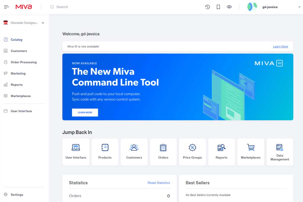
Miva 10 Home Screen
When we take a look at the two latest versions, there is immediately a big difference in appearance. However the changes aren’t just aesthetic. The colors, the logos, the promo banner all remain similar. But what you find is a redesign geared towards improving the user experience.
Dashboard
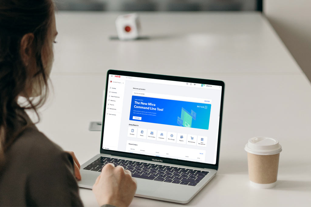
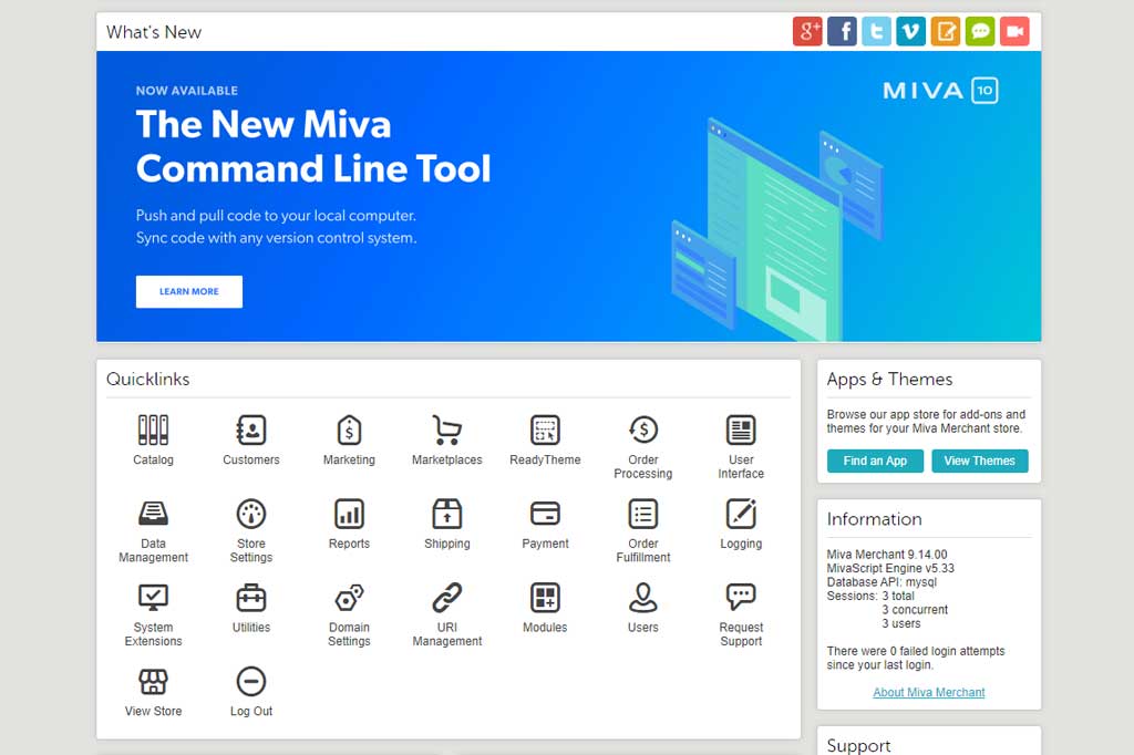
If you’re familiar with being in your Miva admin, the new home screen may make you panic for a moment. Where are all those quick access buttons?! Well, it turns out that grid of icons wasn’t super useful for the average store owner.
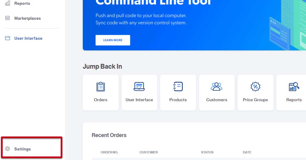
All areas of your admin are still accessible to you, but you no longer have to trip over buttons that you’ve likely never clicked on before. Instead, you’re presented with a dashboard of your most recently visited admin sections, called Jump Back In.
Dynamically updating to give you easy access, this section is going to be useful for the users that typically only deal with a handful of tasks in your admin. However, the buttons update as you use them, moving to different spots in the list. That means you won’t be able to depend on the muscle memory of moving your cursor to the right spot when you sign in. While it won’t take a lot more time to locate the button you want, when you have a disgruntled or confused customer on the phone, every second counts.
This slow-down may be partially mitigated by the list of 8 most recent orders displayed on the homepage. I say may be mitigated because depending on how many orders you get in a day, those 8 displayed may have come in within the last few minutes.
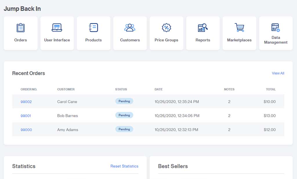
Oftentimes when you need to access an order, it’s after the shopper has received and reviewed their order confirmation, or you’ve imported the order to your order manager. We are withholding judgement about how useful this “recent orders” section is really going to be.
Left Navigation Panel
If you happen to be the type of employee or owner that uses all areas of the admin on a fairly regular basis, you can still reach them quickly enough via the new navigation panels.
The new collapsible left hand panel replaces the dropdown menu from the previous version, and is divided in a way that will, once again, improve usability for the store owner. Broken into sections, the typical user will find most of their needs met at the top. Further down, you’ll encounter the menu options typically used by developers, and yet further down is a settings menu, neatly tucked away behind a secondary menu button.
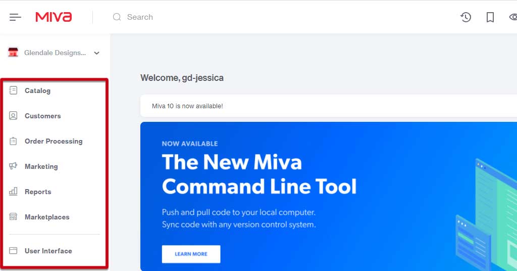
Containing everything you need for day-to-day operations, you have a generally nicer looking access point that is also less crowded than the menu in Miva 9. That separation is nice, and again caters well to the surface-level Miva users.
There doesn’t seem to be much rhyme or reason to the items put in the secondary settings menu; they give the distinct impression of being shoved in a closet because company’s coming. But the items there are likely going to be little used by store owners anyway.
Top Navigation
An exciting change to the navigation is a small addition to the bar at the top of the page. You’ll notice that the bookmarks button remains, as does the search, and the history. But nestled in alongside them is a little eye icon.
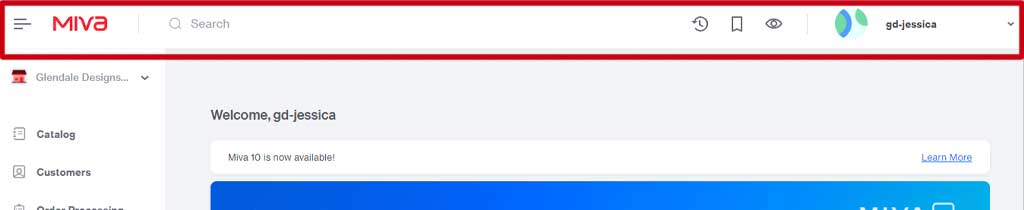
The eye icon is a button that replaces the “View Store” option from the Miva 9 home screen, and best yet, it’s global. Specifically, that means that no matter where you are in the admin, when you click that icon, a new tab will open with your live store, to the page you’re currently editing. It’s a small change that will help to speed up and refine the workflow of regular store edits.
Home Screen Impressions
For the surface-level user (ie. Customer service employees, store owners that don’t make major site changes), the changes to the Miva 10 interface will be welcome. It will be easier than ever to access those portions of your admin that you use on a day-to-day basis. While the changes aren’t significant, they will make for a pleasant experience.
For more advanced users, the changes to the UI will pretty much be a lateral move. You’ll have to spend a little bit of time getting used to the new locations of the items you want to access, but the layout is easy to navigate and organized in an intuitive way.
Batch Lists in Miva 10
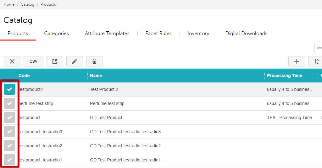
When we talk about batch lists, we are referring to any list you may work on in your Miva admin, for example, your product catalog. There have been a handful of changes to list features that are again geared to improve the user experience.
Editing List Items
A small addition made was the inclusion of a “select all” checkbox. It’s such a simple feature and seems so obvious. We already had checkboxes in Miva 9, it almost seems crazy that there wasn’t a “select all” button before now. In that respect, it’s a good addition, but seems like something we should have already had.
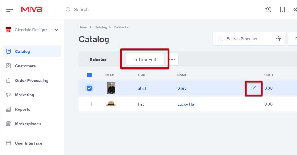
Another small change, but this one seems less necessary, is the way you accomplish in-line editing. In Miva 9, you had the ability to edit products on the fly by quickly double-clicking the product, making your change, and hitting your Enter key to save.
You can still quickly edit, but they’ve taken away the ability to double click. Instead you select an in-line edit button. With double clicking being so ubiquitous, it seems totally unnecessary that they would remove that functionality from Miva 10.
There are a number of small changes made to the way you edit batch lists in Miva 10 and we aren’t convinced they are all for the better, or even necessary, though they won’t really make things worse, either. It will take you a little bit to get used to the way you carry out edits, and in our opinion, to no great improvement in the user experience.
Changes To Views
It seems as though the team working on the Miva 10 update may have paid more attention to accessibility when it comes to lists. With the option to adjust row sizing (to Comfortable, Compact, or Default), you have a bit more freedom to customize how much data you see on the page, giving some relief to those users who may have vision impairment.
However, short of showing the product image thumbnail (Oh ya! There are product image thumbnails now.) a little bit larger, the “Comfortable” view doesn’t increase the display size of the information in the list.
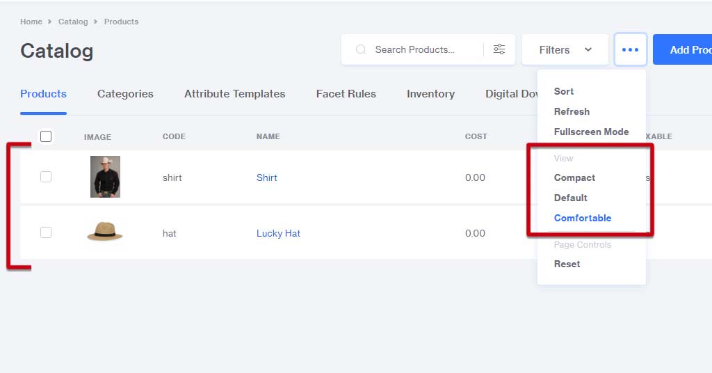
The different heights are nice, but a more elegant solution may have been click-and-drag resizing like you find in spreadsheet software. That would at least allow some more flexibility, and maybe even the possibility for text to wrap, instead of just providing more white space.
You also now have the option to view your page full-screen. That will open any list or modal popup into a full-screen view for maximum visibility. This will be especially useful if you have to make changes to a large amount of products. This is another example of a small but helpful addition.
Batch List Impressions
Next to the order screen and the product pages, the batch lists get the most use by store owners. The changes made to the way these lists are viewed and edited are small, but plentiful. Whether those changes are going to be super useful to the average user remains to be seen.
Other Changes Throughout Miva 10
Many of the changes that have already shown themselves pop up here and there throughout the rest of the admin. Page and list views, button styles, and other interface changes carry through most sections; you’ll acclimate to them fairly quickly.
At this point in the release there aren’t a whole lot of big new functionalities that will greatly change the way your store operates. Perhaps Miva will roll them out in further version updates, or maybe the admin will mostly stay as is.
But for now, once you get used to the new interface, it should be pretty smooth sailing through the rest of the platform.
Developer and Performance Changes
Many of the changes made within Miva 10 happened out of sight for the typical store owner. Generally speaking, you won’t have to be concerned with things like optimized queries or branch deployment and templates.
There were a ton of significant alterations made that will affect how our developers and designers will work on your site. For the most part, those changes seem to be making our developers happy.
When you have work done to your site, you may get to encounter a few of those yourself if you’re hands-on with the work (updating your own banner images, page content, etc.). But besides the layout and a few of the section names, not too much that you’ll be accessing has changed.
Overall Impressions
Upon viewing the Miva 10 teaser trailer, it was tempting to marvel (and maybe worry) at how different everything was. But upon closer inspection, we found that apart from the new interface, and some fun new functionalities, there isn’t a whole lot that’s changed between versions 9 and 10. At least, not in an immediately noticeable way.
And if you ask us, that’s a good thing! Once store owners and staff are past the initial wonderment of a new look, and the novelty of the neat new features wears off, it will be very much business as usual. That is ideal. We predict that the parts of the new release that affect the store-level users will quickly become second nature; day-to-day tasks will naturally feel a little bit easier, a little bit smoother, and a little more convenient.
Moving Forward With Miva 10
If you’re itching to upgrade to the new version, take a deep breath and a step back. As with any new version release, we recommend waiting to update at least until any bugs and kinks are worked out. In the case of this new version, there are a few extra steps.
We strongly encourage you to contact Miva about acquiring a Dev (development) version of your site and upgrading that to Miva 10. Allow yourself and your staff time to play around, navigate, get used to the new setup.
Once you’re completely comfortable with it, only then should you move forward with updating your live site. You shouldn’t see any changes on the front end either way, but if you update too soon, you may find yourself struggling to operate the store behind the scenes.
Have questions about getting going with Miva? Reach out to us with any questions and we can offer some guidance before you move forward with the update.