
Estimated reading time: 7 minutes
Pop-up alternatives can make all the difference in your user experience, and your resulting analytics. Don’t let the necessity of delivery fast information overtake the UIUX of your site.
Pop-ups have been around since the dawn of time… as far as the internet goes, at least. They were originally primarily used for advertising; the digital version of the junk mail flyer. They would often be intrusive and flashy, with auto-play audio and destructive malware. But as pop-up blockers began to be more commonplace, they lost their gateway onto the user’s screen. Since then, the structure and usage of pop-ups has changed.
While there are still sites that use pop-up style advertisements, that’s no longer their exclusive format. They’ve been put to use in a number of different ways, but have we gotten over the collective trauma that late-90s pop-ups caused? Is there a place for pop-ups in a modern e-commerce site?
The Cons of Pop-Ups
There’s no doubt that this style of advertising can be a nuisance. Pop-ups have garnered a bad reputation over the decades, for good reason. But they are still being used! For the most part, you don’t encounter too many of the loud, flickering, neon-colored advertisements that open a new screen. But there are still plenty of cons that make modern pop-ups a less-than-ideal delivery method for your information.
Hurt Your Ranking
Auto-play was stock-standard for most pop-ups, back in the day. And unbelievably, it’s still used! Users are pretty vehemently and unanimously against auto-play on websites. Even if Google doesn’t directly penalize you for auto-play, you will feel the effects of people immediately leaving your site when the audio starts (aka bouncing). The increased bounce rate will negatively affect your search engine ranking.
Impede User Experience
Auto-play isn’t the only reason users will bounce. While you may be trying to sincerely offer helpful information, a pop-up interrupts the user experience. So many users depend on speed, accuracy, and function. A window popping up and slowing them down can be enough to cause someone to abandon your site and move on to a competitor.
Negative Overall Impression
Sloppy interface design for your pop-up can also be a killer. In the efforts to keep the user looking at the pop-up, many sites will make the “close” button impossibly small, nearly invisible, and sometimes downright insulting. Many sites will use guilt-trip style decline buttons known as “confirm shaming” or “negative opt-out” to try and manipulate the user into converting. These “UX dark patterns” are sketchy tactics that will leave a bad taste in the user’s mouth.
Pop-ups interfere with the user experience and can sour their opinion of your brand. Your SEO ranking and conversion rates will suffer.
The Pros of Pop-Ups
Despite the serious inherent flaws of slapping your users in the face with information, pop-up style, they do still serve a purpose. If they didn’t, they wouldn’t still be making the rounds more than 20 years after their inception. So what are the benefits of pop-ups that lead plenty of online sites and retailers to continue using them?
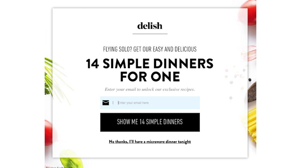
Collect Data or Leads
Whether you are requesting feedback or fishing for leads, form-style pop-ups can be customized to collect all sorts of user-supplied information. Opt-in checkboxes in the checkout only work if the user gets that far, and footer sign-ups can be easily missed if the user doesn’t scroll to the bottom. With a pop-up, there’s no missing the opportunity to sign up for a newsletter or fill out a survey.
Provide Purchase Incentives
Be it promotional codes, flashy sale details, or a free shipping offer, a pop-up will make sure they get in front of your shopper’s eyes. Plenty of consumers bounce from site to site looking for the best deal. If you can get an incentive front-and-center, that might help the shopper stick around.
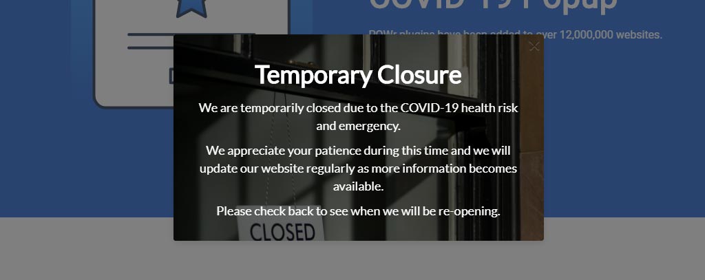
Provide Information That Can’t Be Missed
When we say “can’t” be missed, we mean, under no circumstances should that information be missed. Depending on how you interpret that, it might mean a new product line release, or changes to your policies. In this day and age, it might be COVID-19 related information. Regardless, it’s information that you want to slap your shoppers in the face with.
Pop-ups can provide and collect important information in attention-grabbing ways, increasing the chances of the user seeing it.
Alternatives to Pop-Ups
While their longevity may seem perplexing, pop-ups wouldn’t still be around if they didn’t provide a valuable service. However, just because pop-ups are how we’ve always done it, doesn’t make them right. Luckily, there are some alternatives that won’t be nearly as annoying to your customer.
Lead Magnets
If you’re unfamiliar with the term, a lead magnet is a piece of valuable content that users will happily offer up their contact information to receive. Depending on the type of industry you’re in, some examples of lead magnets might be:
- Seasonal look-books for fashion retailers.
- Recipe ebooks or conversion charts for specialty food stores.
- Instructional or maintenance guides for machine part sellers.
If you have a resource to offer, and can put a decent amount of time into making it something worthwhile, you might have a great lead magnet on your hands. Users are far more likely to hand over their contact information if they get something concrete out of the deal.
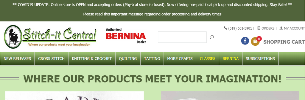
Global Banners
Global or site-wide information banners are a great way to provide important information without being a nuisance. Even better than a pop-up, which might be closed out of spite before the user even reads it, the banner displays at the top of your site regardless of the page they are viewing. Just like pop-ups, they can be customized with colors, fonts, styles, and links, just like a pop-up.
Stationary Banners
You’ve likely seen them at the top of a web page. They stick up there and display the content (often an ad) even while you scroll down the page. They are often big and bold, but they don’t block the content. If you want to get even less intrusive, a sidebar ad might do the trick. These are great tools to use that keep the ads on screen without seriously impacting the user experience. If you can manage to make the content relatable to the page it’s on, so much the better. These banners are a great spot to showcase your lead magnets. Neil Patel uses this style and makes it even less intrusive by keeping the banner narrow and minimalistic.

Slide Ins
Exactly like they sound, this style of ad doesn’t pop-up, it slides in. Typically from the side of the page, and usually only part of the way into the screen, sliding banners are more subtle. The ad, video, or form, doesn’t block the page content, allowing the user to continue unimpeded. Furthermore, the motion of the ad draws the eye without having to rely on flashing text or cheesy animated graphics. They often take advantage of video capabilities but if you take this route, be careful of enabling auto-play on the video’s audio!
Embrace the Change
Are you guilty of using any of the negative pop-up tactics listed above? You may not be realizing how much they could be hurting your site’s ranking and reputation. Try switching to a pop-up alternative and monitor over a couple of months to see how your analytics change. Get in touch with us to try out something different for your newsletter sign-ups, feedback forms, and advertisements.