Estimated reading time: 6 minutes
Anyone who has dabbled in design or marketing knows that it’s the little things that work together to make a big impact on users. The results of those little things can add up to clicks, sales, subscribes, and overall impressions. This series talks about how the little things can play a big part on your site.
I’ve been honing my psychic ability lately. Watch: I’m sensing that a large portion of your “above the fold” content is a hero image banner. Well… how did I do? Yeah, okay, maybe not that impressive. But I also sense that many of you employ rotating banners to show off different sales or product lines. Did you know these rotating banners may not be having the impact you think they are? Are static banners the future of eCommerce sites? Which one shows up in the crystal ball when you compare rotating vs static banners?
The Glory Days of Rotating Banners
It used to be that rotating banners, also called image carousels, were the hot, fresh thing for any hip website. But you can tell how long ago that was by my use of the word “hip”. Believe it or not, if rotating banners were people, they’d be legally allowed to drink. They’d have graduated their undergrad program and be halfway through med school by now. Image carousels started making the rounds (get it?) circa 1997.
At the time, they were a fun spectacle of internet innovation. Images and text and animation all in one blocky bundle. However, this was back when there weren’t many other site features available, and the banners didn’t have to fight for attention (or bandwidth). They were definitely the hot shots of their time.
But has the charm worn off? Are they just living in your basement, watching your TV, and eating all your groceries? Perhaps they have managed to hold onto the characteristics that once made them so unique and appealing. We looked into the analysis of this popular site feature to see if it still holds up after all these years.
What the Research Says About Rotating Banners
With over two decades of data to collect, you can be sure there are some solid findings about whether or not rotating banners are good for your site.
According to multiple studies spanning several years, carousels don’t work well for mobile or desktop sites, and here’s why:
- Weak signifiers cause people to miss content. If you can’t see the low-contrast dots, or the directional arrows blend into the image, users may not even see the next image, unless it auto-rotates.
- People don’t like auto-rotating banners, either. Image carousels get roughly 1% of users to click through, and 89% of those people only bother with the first image. If you get 100 people on your site in a day, there’s a chance that your subsequent banner images won’t even be seen.
- Banner Blindness is probably to blame for this! The joy of human evolution – over the last few decades, humans have learned to skip our eyes past most banners because they are likely to be ads. This is especially true if the banner is animated in some way, the way a rotating banner is. Once your user’s eyes detect movement, they will skip right past the banner all together.
Should I Use a Static Banner Instead?
With image carousels being so ubiquitous for so long, you may find yourself at a bit of a loss. What do you put on your site instead? Are static banners better? The answer is yes, but not by much.
If you use a static (unmoving) hero image in place of your rotating banners, you’ll be marginally better off, but you will still have to contend with the banner blindness. Also keep in mind that 1% I mentioned earlier. That was only 1% of users even before the banner changed. Banners just aren’t that effective.
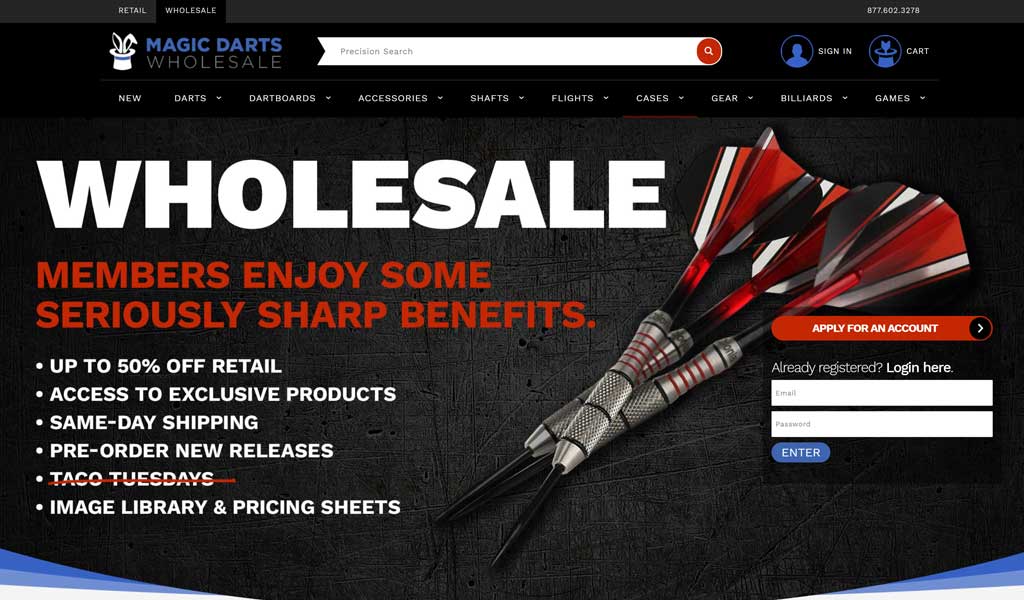
When designing sites, we use a combination of different options, depending on the site design and the client’s needs. Take a look at MagicDartsWholesale.com, for example:

We integrated the main hero image into the design of the site and implemented a form on top to make the space usable. It also provides very limited details to the viewer to avoid an overload of content all at once.
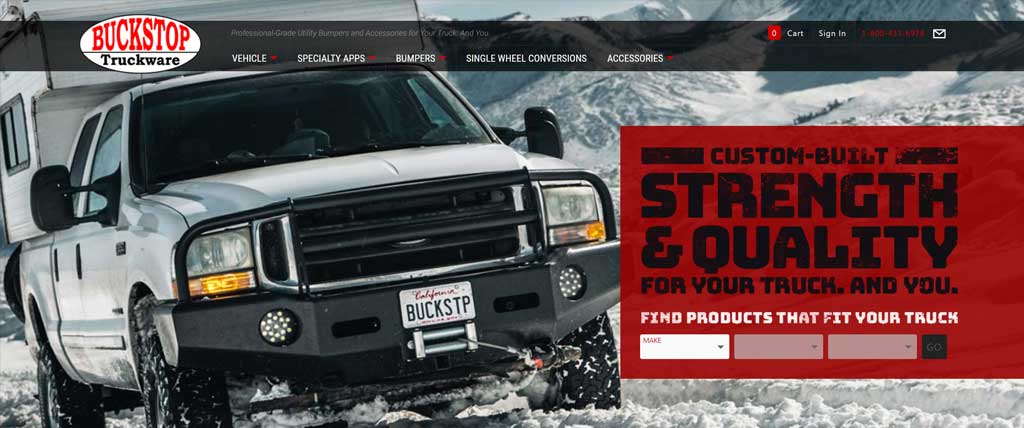
Or we have sites like Buckstop.com that use a configurator to direct the shopper to the right products for their vehicles. The tool is the main attraction, and the hero image simply adds some background panache.

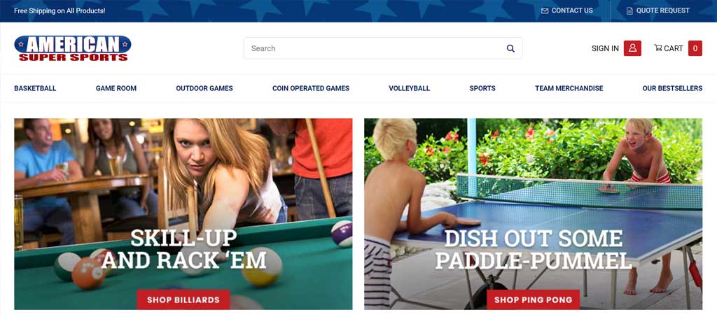
And sometimes we don’t even use a hero image, instead just jumping into the good stuff – featured categories and products, like on AmericanSuperSports.com.

The most attractive quality of those examples is that value is offered to the shopper right away. They are immediately greeted with a feature that will make their experience on the site more valuable, without taking away from the visual appeal of having attractive images.
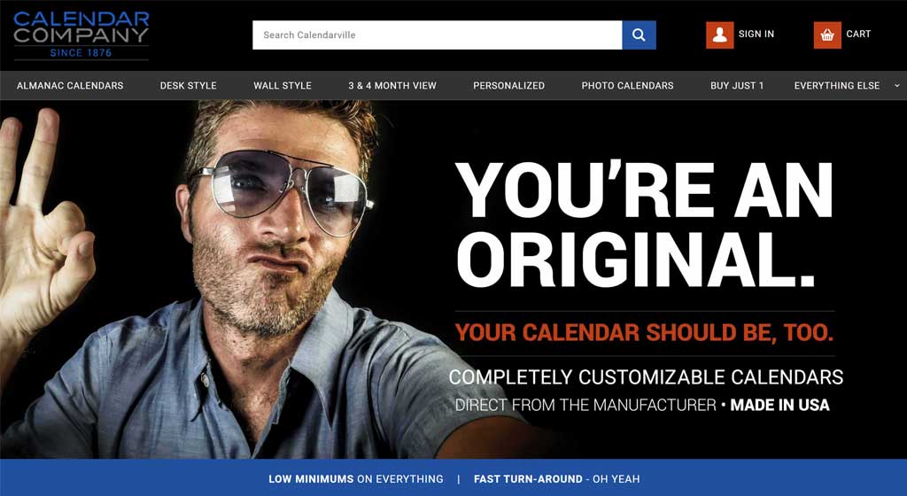
There are certainly times when a single static hero image does work for a site. When it helps deliver a brand identity, like on CalendarCompany.com. Here you’ll find the voice of the brand, as well as a short line describing exactly what you’ll find on the site.

The Final Word on Rotating Banners
Pack their bags and kick ‘em out! Rotating banners don’t offer nearly enough value for you to be letting them live rent-free on your homepage. That is prime real estate that could be put to better use.
If you still aren’t sure whether you should ditch your hero banners, try setting up tracking through your Google Analytics account. Track to see how many users are actually getting value from your banner.
For help setting up or analyzing that tracking, or some assistance sprucing up your homepage, contact us. We can help you come up with a better use for the space that will improve your user experience.